Welcome to the website for landscape facilities products and knowledge.

What are the psychological effects of color choices in landscape tables on user experience?
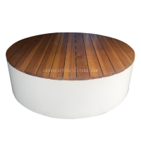
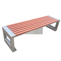
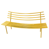
Color choices in landscape tables play a pivotal role in shaping user experience, often subconsciously influencing emotions, behavior, and engagement. Research in color psychology reveals that warm hues like red and orange evoke energy and excitement, making them ideal for social or interactive spaces. Conversely, cool tones such as blue and green promote calmness and focus, suitable for relaxation areas.
Neutral colors like beige or gray offer versatility but may lack emotional impact without strategic contrasts. The saturation and brightness of colors also matter—vibrant shades draw attention, while muted tones create subtlety. Cultural associations further complicate choices; for instance, white symbolizes purity in some cultures but mourning in others.
Designers must balance aesthetics with functionality, ensuring colors align with the table’s purpose. A well-chosen palette can enhance usability, reduce stress, and even boost productivity. By understanding these psychological nuances, creators can craft landscape tables that resonate deeply with users, transforming ordinary spaces into emotionally intelligent environments.
Related search: