Welcome to the website for landscape facilities products and knowledge.

What are the most common challenges in coordinating the table’s color with existing outdoor decor?
Creating a harmonious outdoor space requires careful color coordination, yet many homeowners face significant challenges when selecting table colors that complement their existing decor. The first major hurdle involves accounting for natural lighting variations, as colors appear dramatically different in bright sunlight versus shaded evening hours. Many people underestimate how sunlight bleaches and alters color perception, leading to mismatched furniture sets that looked perfect in the showroom but clash in the actual outdoor environment.
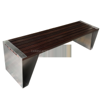
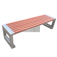
Another frequent challenge stems from material limitations, as outdoor tables come in specific finishes and colors dictated by weather-resistant materials. While you might desire a particular shade, the available options in durable materials like powder-coated aluminum or synthetic wicker might not align with your vision. This material-color relationship often forces compromises between aesthetic preferences and practical durability requirements.
The existing color palette of your outdoor space presents a third obstacle, particularly when working with fixed elements like house siding, deck staining, or permanent landscaping features. These established colors create a framework that limits your table color options, especially when dealing with bold or unconventional existing color schemes that dominate the visual space.
Seasonal decor changes introduce additional complexity, as tables must coordinate not only with permanent fixtures but also with rotating seasonal accessories. A table color that works perfectly with your summer brights might clash with autumn earth tones or holiday decorations, creating a year-round coordination dilemma that many homeowners struggle to resolve satisfactorily.
Finally, the psychological impact of color in outdoor spaces creates subtle but important challenges. Cool colors like blue and green tend to recede visually, while warm colors like red and orange advance, potentially making your table appear disproportionately large or small within the space. Understanding these visual effects is crucial for creating balanced outdoor arrangements that feel intentionally designed rather than accidentally assembled.
Related search: