Welcome to the website for landscape facilities products and knowledge.

What are the most popular color schemes for landscape bar counters to blend with natural surroundings?
Creating a seamless transition between built environments and nature requires thoughtful color selection, especially for landscape bar counters that serve as social hubs in outdoor spaces. The most successful color schemes draw inspiration from the immediate surroundings, creating harmony rather than contrast.
Earthy neutrals remain the most popular choice for their versatility and organic appeal. Warm taupe, sand, and greige tones mimic natural stone and soil, allowing the structure to blend with the terrain. These subtle hues provide a neutral backdrop that lets landscaping elements take center stage while maintaining sophistication.
Forest-inspired palettes bring depth and richness to outdoor bars. Deep greens ranging from sage to hunter create a camouflaging effect when surrounded by vegetation. When paired with natural wood accents, these colors evoke a tree canopy feeling, making the bar counter feel like a natural extension of the garden.
Coastal color schemes incorporate soft blues, weathered grays, and whitewashed tones that reflect beach environments. These colors work particularly well in seaside settings where they mirror the colors of sky, water, and driftwood. The weathered appearance suggests natural aging and exposure to elements.
Desert tones have gained popularity for their warm, contemporary feel. Terracotta, burnt orange, and pale adobe colors reference Southwestern landscapes and work beautifully in arid climates. These hues create warmth during daylight hours and glow magnificently during sunset gatherings.
Monochromatic stone schemes utilize the natural color variations found in local materials. Using granite, limestone, or slate in their untreated states creates authentic connections to regional geology. This approach ensures the bar counter looks indigenous rather than imported.
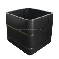
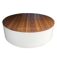
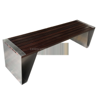
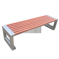
Two-tone combinations balance visual interest with natural integration. Pairing a dark base color with a lighter countertop, or vice versa, creates dimension while maintaining organic credibility. The key is keeping both colors within the same natural family—such as charcoal with sandstone or dark walnut with cream.
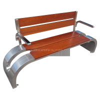
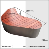
Finally, weathered wood finishes provide the ultimate organic integration. Allowing wood to gray naturally or using stains that enhance rather than hide the material's character creates timeless appeal. This approach works particularly well with live-edge counters that maintain their natural shape.
The most successful color schemes share one common trait: they look like they belong rather than stand out. By drawing color inspiration from the specific environment—whether forest, coast, desert, or garden—landscape bar counters can become harmonious elements that enhance rather than compete with nature's beauty.
Related search: