Welcome to the website for landscape facilities products and knowledge.

How does the choice of color for a landscape bar counter influence its visual impact and heat absorption?
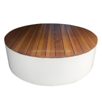
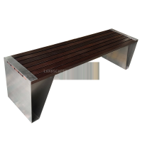
The selection of color for a landscape bar counter significantly influences both its aesthetic presence and functional performance in outdoor environments. Darker hues like charcoal gray or espresso brown tend to create dramatic visual anchors that command attention, making them ideal for contemporary designs seeking bold statements. These colors absorb substantially more thermal energy, sometimes reaching surface temperatures 20-30°F higher than lighter alternatives under direct sunlight. This thermal characteristic can be advantageous in cooler climates where residual warmth extends evening usability but proves problematic in hot regions where surfaces become uncomfortable to touch.
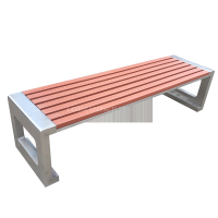
Lighter tones such as sandstone beige or quartz white reflect more sunlight, maintaining cooler surfaces that are pleasant to contact even during peak daylight hours. These shades visually recede into the landscape, creating an airy, expansive feel particularly beneficial for smaller spaces. The reflectivity also reduces the urban heat island effect, contributing to cooler microclimates in entertainment areas.
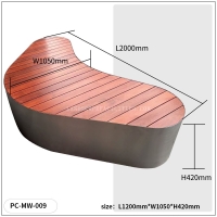
Beyond monochromatic choices, multi-tonal finishes like terrazzo or composite materials distribute thermal absorption more evenly while adding visual depth. Textured surfaces in medium tones provide an optimal balance, offering sufficient light reflection to minimize heat retention while providing enough visual weight to define the space effectively. The psychological impact of color should not be overlooked—cool blues and greens evoke tranquility while warm terracotta and amber tones stimulate social interaction.
Material composition interacts significantly with color performance. Stainless steel maintains the most consistent temperature regardless of hue, while masonry and concrete exhibit the greatest thermal variance between light and dark finishes. Modern nano-pigment technologies now allow for darker colors with reflective properties, challenging traditional compromises between aesthetics and functionality.
Ultimately, the optimal color selection balances microclimate conditions, intended usage patterns, material properties, and design objectives. Testing sample materials in the actual installation environment remains the most reliable method to evaluate both visual impact and thermal performance before final implementation.
Related search: