Welcome to the website for landscape facilities products and knowledge.

What are the psychological effects of different colors used in landscape bar counter designs?
The strategic use of color in landscape bar counter design extends far beyond mere aesthetics, directly influencing patron psychology, behavior, and overall experience. This design element is a powerful, non-verbal tool that can shape the atmosphere of a commercial space. Warm colors like reds, oranges, and yellows are often employed to stimulate energy and appetite. Red, in particular, is known to increase heart rate and create a sense of excitement and urgency, which can subtly encourage quicker turnover. Orange fosters sociability and warmth, making it ideal for bars aiming for a lively, conversational vibe. Yellow evokes feelings of happiness and optimism but should be used sparingly as it can be overwhelming.
In contrast, cool colors such as blues, greens, and purples tend to have a calming, soothing effect. Blue is renowned for suppressing appetite and promoting relaxation, making it suitable for upscale, lounge-style bars where patrons are encouraged to stay longer. Green creates a sense of balance and harmony, often associated with nature and health, which can be perfect for organic or garden-themed establishments. Purple conveys luxury, sophistication, and creativity, often used in high-end cocktail bars to enhance the perception of premium quality.
Neutral tones like beige, gray, and white provide a foundational backdrop. They allow the vibrant colors of drinks and decor to pop while offering a sense of sophistication and cleanliness. The interplay of these colors within the long, continuous surface of a landscape bar counter guides the visual journey of a customer, ultimately affecting their mood, dwell time, and spending habits. Understanding this color psychology is therefore not just an artistic choice, but a critical component of successful commercial interior design.
Related search:
Recommendation
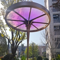
Metal frame with gradient color acrylic combined with high-end shading landscape facilities