Welcome to the website for landscape facilities products and knowledge.

What are the most popular color schemes for landscape bar counters in residential versus commercial settings?
The choice of color scheme for a landscape bar counter—a long, horizontal surface ideal for entertaining—fundamentally shapes the ambiance of a space. While the form follows function in both environments, the driving forces behind color selection in residential versus commercial settings differ dramatically, leading to distinct popular palettes.
In residential settings, the landscape bar counter is often an extension of the living area or kitchen, prioritizing harmony and personal well-being. Homeowners gravitate towards colors that create a serene, inviting, and timeless atmosphere.
* Dominant Neutrals: Warm, soft neutrals reign supreme. Shades of off-white, cream, warm gray, and greige (gray-beige) are incredibly popular. These colors offer immense versatility, acting as a perfect backdrop that allows other design elements, like statement lighting or colorful bar stools, to shine. They make spaces feel larger, brighter, and effortlessly elegant.
* Organic and Earthy Tones: Reflecting a desire to connect with nature, colors drawn from the earth are a major trend. This includes the enduring popularity of various wood stains, from light oak to rich walnut, which add inherent warmth. Softer tones like sage green, muted blues, and taupe are also sought-after for their calming, organic feel.
* Subtle Veining and Movement: While not a single color, the use of materials like quartzite or marble with subtle, flowing veining in gray, taupe, or cream is a definitive trend. It adds visual interest and luxury without overwhelming the senses, perfectly suited for a home's relaxing vibe.
The commercial landscape bar counter, found in hotels, restaurants, and bars, is a workhorse designed for durability, brand alignment, and creating a specific customer experience. The color schemes are often bolder, more dramatic, and chosen for impact.
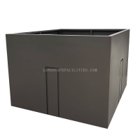
* Dark and Dramatic Bases: Deep, saturated colors are frequently used to convey sophistication, luxury, and a sense of intimacy. Charcoal gray, matte black, and deep navy blue are highly popular for their ability to hide stains and wear in high-traffic environments. These colors create a strong, grounding base for the bar.
* High-Contrast and Statement Materials: Commercial designs often embrace high-contrast combinations. A classic black countertop with a stark white waterfall edge makes a powerful statement. Similarly, bold materials like terrazzo with colorful chips, large-format porcelain slabs with dramatic patterns, or even richly colored concrete are chosen to become a focal point that patrons remember.
* Metallic and Industrial Accents: While the counter surface itself might be a solid color, commercial schemes frequently integrate metals. Brushed brass or copper inlays, stainless steel sections for practicality, or blackened steel accents are common. These elements contribute to an industrial-chic or luxe aesthetic that is less common in homes.
The core difference lies in intention. Residential color schemes are personal, aiming for comfort and timelessness with soft neutrals and organic tones. Commercial schemes are strategic, using darker, bolder colors and high-contrast materials to build a brand identity, ensure durability, and craft a memorable public experience. Ultimately, the most popular color is the one that best serves the fundamental purpose of the space it occupies.
Related search: