Welcome to the website for landscape facilities products and knowledge.

What are the most popular color schemes for landscape bar counters, and how do they influence customer preferences?
The color scheme of a landscape bar counter plays a crucial role in shaping the atmosphere of a commercial space and significantly influences customer behavior and preferences. The most popular color schemes currently dominating bar design include warm earth tones, industrial dark palettes, natural wood finishes, coastal blues, and minimalist neutral schemes.
Warm earth tones such as terracotta, amber, and deep burgundy have gained substantial popularity for their ability to create an inviting and cozy atmosphere. These colors stimulate appetite and encourage social interaction, making them particularly effective for bars focusing on craft cocktails and intimate gatherings. The psychological impact of these hues promotes longer stays and increased consumption as customers feel more relaxed and comfortable in these warm environments.
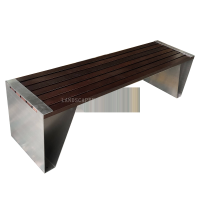
Industrial dark schemes featuring charcoal black, gunmetal gray, and deep espresso create a sophisticated, modern ambiance that appeals to urban professionals and younger demographics. These colors convey luxury and exclusivity while providing an excellent backdrop for highlighting premium spirits and glassware. The dramatic contrast often achieved in these schemes helps direct attention to the bar's offerings while creating a perception of higher value and quality.
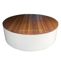
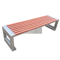
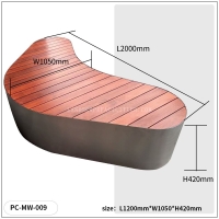
Natural wood finishes remain a timeless choice, with rich walnut, light oak, and reclaimed wood variations offering versatility across different design themes. Wood tones create a sense of authenticity and connection to nature, which resonates strongly with customers seeking genuine experiences. The warmth and texture of wood grain provide visual interest while maintaining a approachable, welcoming feeling that appeals to a broad customer base.
Coastal blue schemes incorporating aquamarine, navy, and seafoam green have emerged as popular choices for bars in resort areas or those aiming for a refreshing, relaxed vibe. These cool tones evoke feelings of tranquility and escape, encouraging customers to unwind and stay longer. The association with water and relaxation makes these colors particularly effective for outdoor or beachfront establishments where the goal is to create a vacation-like atmosphere.
Minimalist neutral schemes using shades of white, beige, and light gray create a clean, contemporary aesthetic that appeals to health-conscious consumers and those preferring understated elegance. These colors provide a blank canvas that allows the bar's offerings to take center stage while creating a perception of cleanliness and sophistication. The airy, open feeling conveyed by light neutrals can make spaces appear larger and more inviting.
The influence of these color schemes on customer preferences extends beyond mere aesthetics. Research indicates that color can affect perceived wait times, with warmer tones making waits feel shorter. Color choices also impact purchasing decisions, with certain hues increasing the perception of value for premium products. Additionally, color schemes contribute to brand recognition and can target specific demographic groups effectively.
Successful bar operators often combine these popular color schemes with strategic lighting to enhance their effects. The integration of materials and textures further amplifies the psychological impact of the chosen palette, creating multi-sensory experiences that resonate with customers on subconscious levels and ultimately drive return business through positive emotional associations.
Related search: