Welcome to the website for landscape facilities products and knowledge.

How do color choices for landscape tables influence their visibility and aesthetic appeal in different settings?
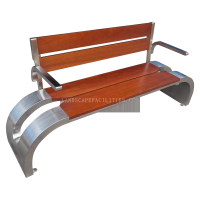
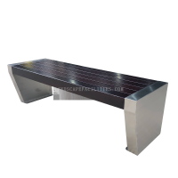
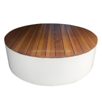
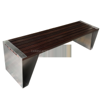
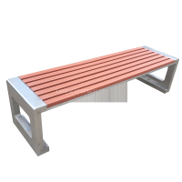
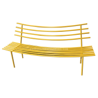
The selection of colors for landscape tables plays a pivotal role in determining their visibility and aesthetic appeal across different environments. Whether placed in lush gardens, urban patios, or coastal settings, the right color can harmonize with the surroundings or create striking contrasts that draw attention.
Visibility: Bright or bold colors like red, yellow, or turquoise enhance visibility in dense green landscapes, making tables easy to locate. Conversely, muted tones like gray or earthy browns blend seamlessly into natural settings, offering subtlety. For high-traffic public spaces, vibrant hues can improve safety by ensuring tables are easily spotted.
Aesthetic Appeal: Color choices also influence the emotional and visual impact of outdoor spaces. Warm tones (e.g., terracotta, ochre) evoke coziness, while cool shades (e.g., slate blue, sage green) promote tranquility. Matching table colors to existing decor or natural elements creates cohesion, whereas contrasting colors can add dynamism.
Material Considerations: The material of the table—whether wood, metal, or synthetic—affects how colors appear under sunlight or over time. UV-resistant finishes help maintain vibrancy, while natural wood stains age gracefully.
Ultimately, thoughtful color selection balances practicality and artistry, transforming landscape tables into functional yet visually captivating focal points.
Related search: