Welcome to the website for landscape facilities products and knowledge.

How do color choices for landscape tables affect their visibility and aesthetic appeal in different settings?
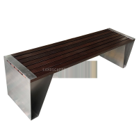
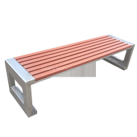
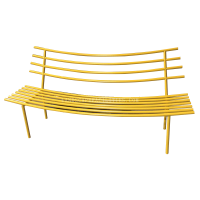
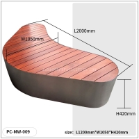
The selection of colors for landscape tables plays a pivotal role in their visibility and aesthetic appeal across different environments. In outdoor settings, vibrant hues like deep blues or earthy greens can blend seamlessly with natural surroundings, creating a harmonious look. Conversely, bold colors such as red or yellow stand out, making tables more visible in crowded or dimly lit areas.
Color psychology also influences perception; warm tones evoke energy and sociability, ideal for dining areas, while cooler shades promote relaxation, perfect for lounges. Additionally, weather-resistant finishes ensure longevity without compromising vibrancy. By strategically choosing colors, designers can enhance both functionality and visual appeal, tailoring tables to their intended use and setting.
For urban landscapes, neutral or metallic tones offer a modern touch, whereas rustic settings benefit from wood-like finishes. Ultimately, the right color choice transforms a simple table into a focal point, elevating the overall ambiance.
Related search:
Recommendation
Metal and acrylic color-changing combined curtain wall for large-scale public landscape facilities